
Selecting the Right Colors for Your Website
Denis Bozhinoski
November 06, 2022
Choosing the perfect colors for your website is one of the most challenging tasks. There are so many colors to choose from and they all have different meanings and associations. This article will help you choose your colors and get a feel for what colors work in different contexts.
Creating a visually appealing website is crucial for capturing the attention of your audience and leaving a lasting impression. One of the key elements in achieving this is selecting the right color palette. A harmonious color palette can greatly enhance the overall aesthetic and user experience of your website. Whether you are a web designer or just starting out, these insights will help you create a visually stunning website that captivates your visitors from the moment they land on your page.
The first thing that you need to do is to identify what kind of website you have and what audience it is targeting. This will give you a better idea on the colors that work best for your site.
There are a few rules when it comes to choosing the right colors for your website:.
- Choose a color scheme that matches your brand's identity
- Use one or two contrasting colors to create visual interest in the design.
- Ensure that you have enough contrast between text and background color so people can read it easily.
Website Design
01
Identify your brand's personality
The first step is to identify your brand's personality. What kind of emotions do you want to evoke in your audience? What is the tone of voice that you want to use?
There are five main types of brand personalities . They are excitement, sincerity, ruggedness, competence, and sophistication.
After identifying what kind of personality you want for your brand, then it's time to think about which colors will work best with it. For example, if the tone of voice is whimsical and playful then bright colors might not be a good fit because they might come across as immature. Instead, choosing softer pastel tones like blue or green might give off more appropriate.
- To emphasize important content, consider using a black and white color scheme.
- Dark Green, Ivory, and Yellow.
- Bright Green and Hot Pink
- White and Lime Green.
- Dark Grey and Yellow-Green.
- Blue Shades and White.
- Beige and Dark Grey.
- Black and Neon Blue.
Some of the latest web design color trends for 2023 include bold colors and hues such as purple, fuchsia, red, yellow, and blue, which give off a modern and energetic feel.
02
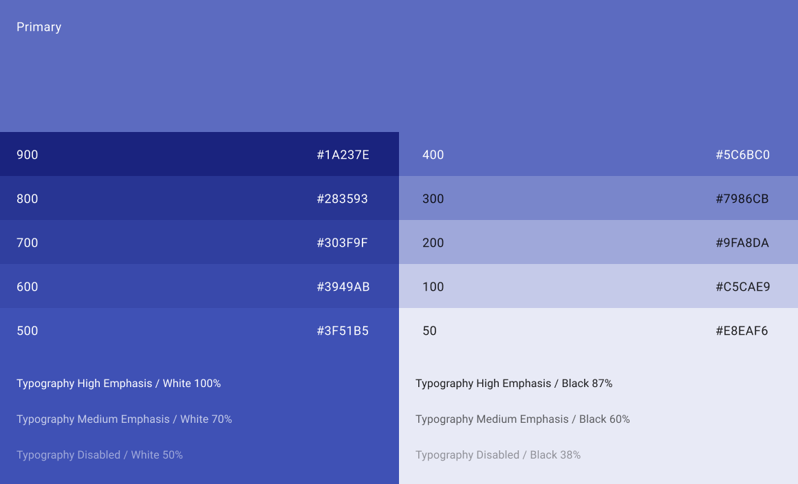
Choosing a primary color
Three Primary Colors : Red, Yellow, Blue. Three Secondary Colors : Orange, Green, Violet. Six Tertiary Colors : Red-Orange, Yellow-Orange, Yellow-Green, Blue-Green, Blue-Violet, Red-Violet, which are formed by mixing a primary with a secondary.
The choice of a primary color is one of the first choices that you'll make when designing your web app. Choosing a color that doesn't work with your company's brand identity can be a big problem. One way to avoid this is to use colors that are in the same family as your brand colors. If you're not sure what colors would work best for your business, then it might be time to hire a branding designer who can guide you through the process and make suggestions based on what they know about your business.
03
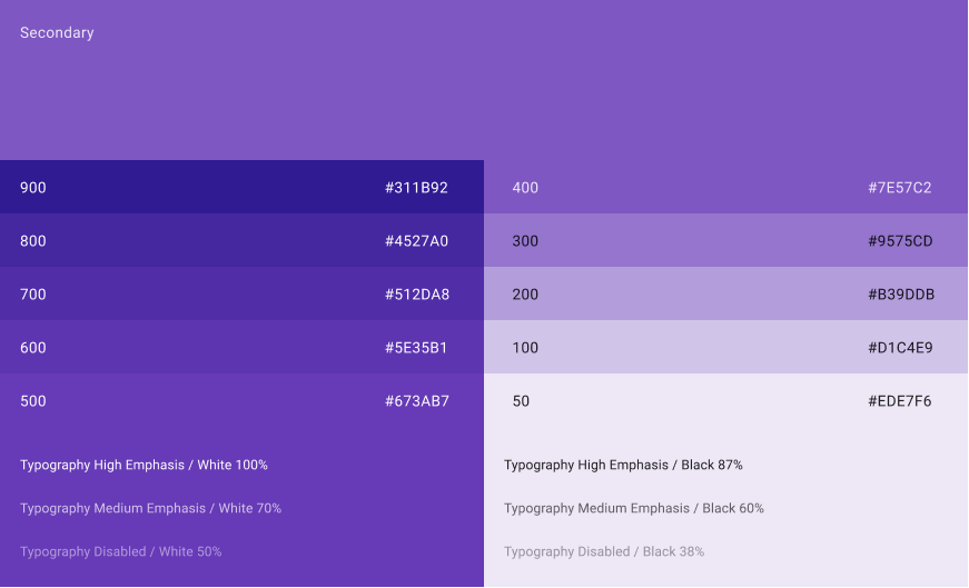
How to Choose your secondary colors
The first thing to consider when choosing a secondary color is the primary color. The secondary color should be complementary to the primary color. The secondary color should be used as an accent and not as a main part of your design. The second thing to consider is what other colors are being used on your site. You also want to make sure that the secondary colors don't conflict with each other, so if you have blue and red on your site, then orange is not a good choice for a secondaries because it will clash with both colors.
04
How to Choose background color for your website
To make sure that the background color complements all of the other elements on your site, it is important to test out different colors before settling on one final option. You want to make sure that it doesn't clash with any of the other elements like text or images and also that it doesn't affect anyone's eyes when they look at it for long periods of time.
You can go for a more muted version of your primary color in order to solidify your branding. This will require a white or grey overlay on the background in order for text to show up. Alternatively, you could just have the whole website be an off-white color, which is the more common choice.
05
Neutral Colors
Neutral colors can create a calm clean and soft background, but you need to consider how other web elements like images and typography fit together.
The basic neutral color palette includes black, white, brown, and gray, with varying shades in between.
Usually neutral colors in webdesign projects are used for background and surfaces.
Inspired by nature and natural materials, Neutral colors can include everything from brown, beige, and green to black, white, and beige.
06
Contrast
Contrast plays a crucial role in guiding users' attention and highlighting important elements on a webpage. By utilizing contrasting colors, designers can effectively differentiate between different sections or levels of information, making it easier for users to navigate and understand the content.Colors have a significant impact on human perception and emotions.
By strategically choosing contrasting colors for different elements, designers can create visual interest and draw attention to specific areas of importance. This can be particularly useful when it comes to emphasizing call-to-action buttons, which are essential for driving conversions and achieving desired user actions.Call-to-action buttons serve as powerful tools in web design, as they prompt users to take specific actions such as making a purchase, signing up for a newsletter, or contacting a business.
By using contrasting colors for these buttons against the surrounding elements, designers can make them stand out prominently on the page.In conclusion, understanding how contrast in web design affects the hierarchy of information using colors and call-to-action buttons is crucial for creating visually appealing websites that effectively guide users through desired actions. With careful consideration of color choices and strategic placement of these elements, designers can enhance user experience and ultimately drive successful outcomes for businesses online.
Warm Colors
- Warm colors include red, orange, and yellow, and variations of those three colors.
- Red and yellow are both primary colors, with orange falling in the middle.
- Warm colors appear closer to the observer.
Cool Colors
- Cool colors include green, blue, and purple, and variations of those three colors.
- Blue is the only primary color within the cool spectrum.
- Greens take on some of the attributes of yellow, and purple takes on some of the attributes of red.
- They are often more subdued than warm colors.
- Cool colors appear farther from the observer.