How to design a good poster ?
Denis Bozhinoski
November 02, 2021
What do you need to consider when designing a poster? Whether you are a professional graphic designer, amateur or beginner, we need to know a few things in advance.
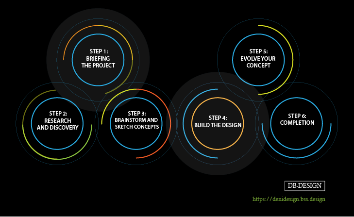
First of all, you need to identify the purpose of your poster, afterwards you need to think about your target audience. It is also necessary to create an appropriate color palette.
Next step is to choose a fancy font, create an interesting typography and be creative. The most important thing is to convey the message to your client through your design. The poster needs to be eye-catching and attractive for the readers and viewers.
Elements of poster design
01
The title of your poster
The title should be short, contain as many keywords as possible and interest the reader to look further.
You need to create a title that is relevant to the theme and content of the poster, but also shows your creativity.
The title of your poster should have a font size of 50 pt , of course depending on the size of your poster. The size of the title sometimes depends on the length of the title itself. For subtitles a font size of 36 pt should be sufficient.
02
The text size
The text size of your poster should have a font of at least 24 pt. Viewers should be able to read your smallest text from a few meters away.
There should be only as much text as needed on your poster. The text should be clear and specific.
All Important Information should be readable from a greater distance.
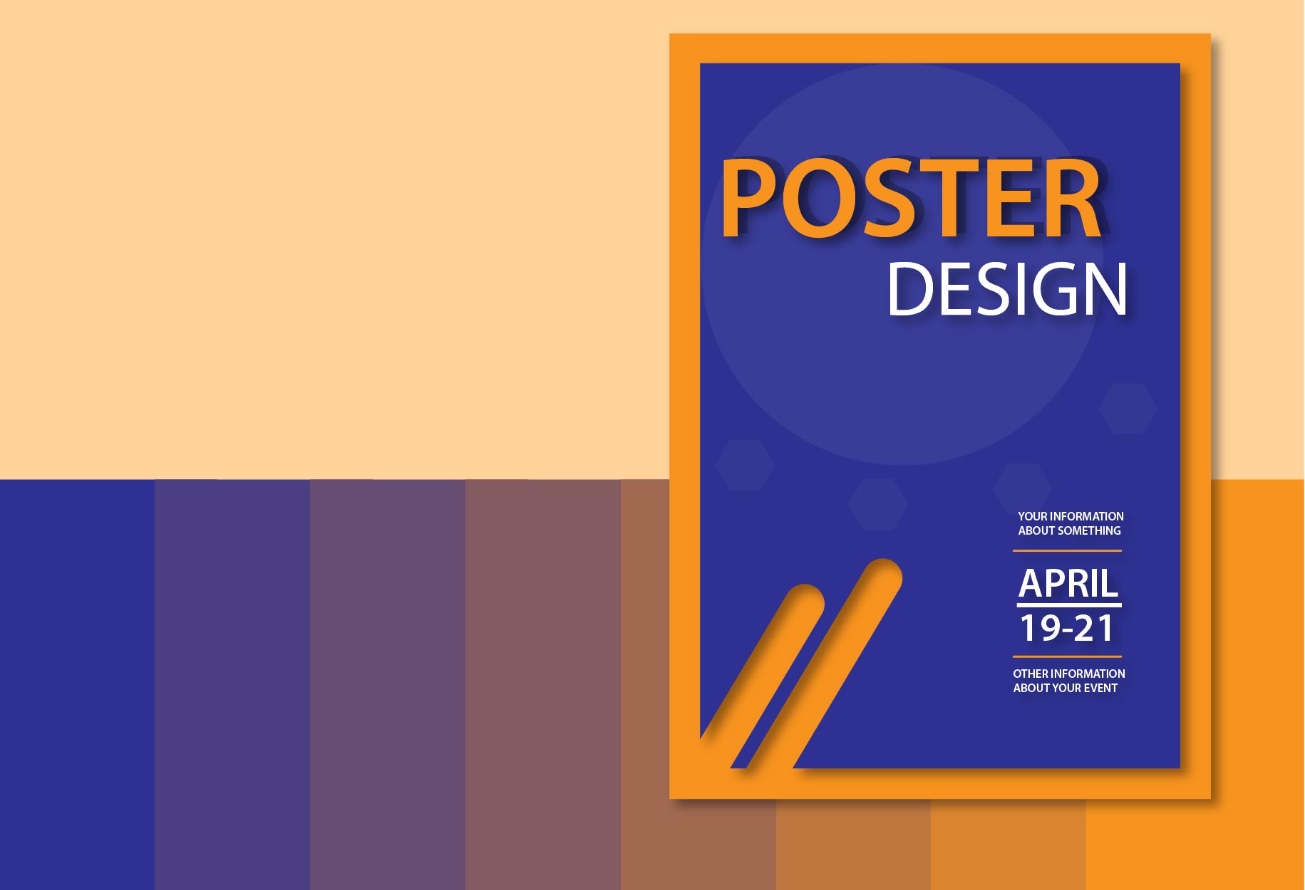 Image credit: DB Design
03
Graphics
Graphics are visual elements and often we use them to direct viewers to certain information.
Graphics are a very important part of your poster. Graphics can include graphs, diagrams, illustrations or images.
Usually we use graphics to visualize the concepts in the design of the poster itself.
04
Whitespace or negative space
White space is a design technique that ensures the use of sufficiently empty or clean space on the canvas.
The white surface in the design itself creates harmony, balance gives simplicity and purity, is also used to guide the reader from one element to another.
So white space is not necessarily white, but it is the negative space between layouts, between titles, between paragraphs, and between different graphic elements.
05
Layout
When designing a poster the layout should be unique, simple and effective.
In graphic design, the layout of the canvas is the layout of the visual elements of the canvas.
Elements of layout are balance, contrast, unity, rhythm and proportion.
The composition of the layout can be classic and symmetrical, or asymmetrical and modern, minimal or complex.
06
Color
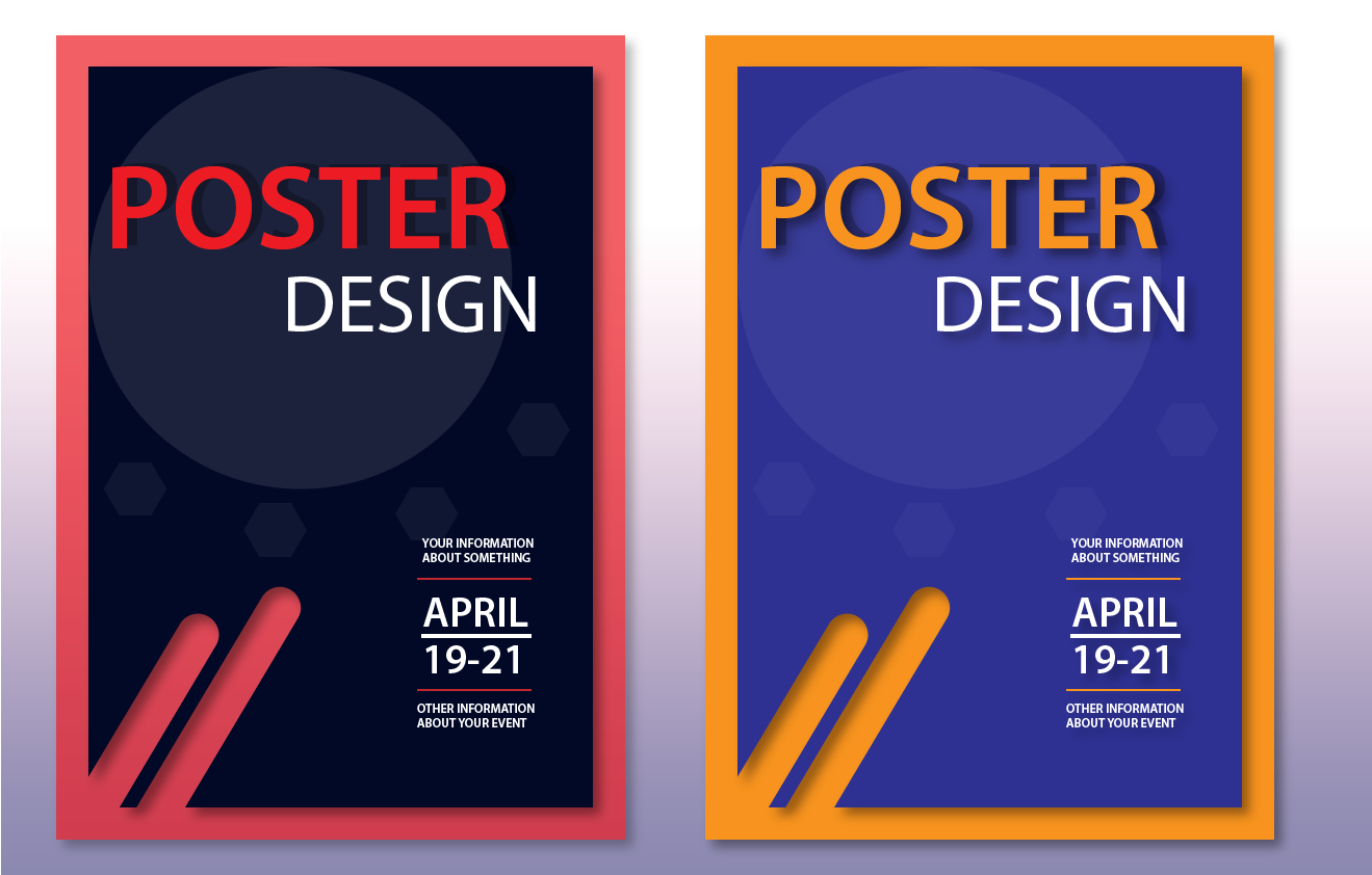
The color is a key part of your poster design. You can create your own color palette for your project. By using a palette of different colors, you can direct the viewer's eye, emphasize important information and strongly influence the reaction of your audience.
When creating a graphic poster you need to have a contrast between the colors of the text and the background. This ensures the readability of the text, which is important for effectively conveying your message. The contrast should be between dark and light colors.
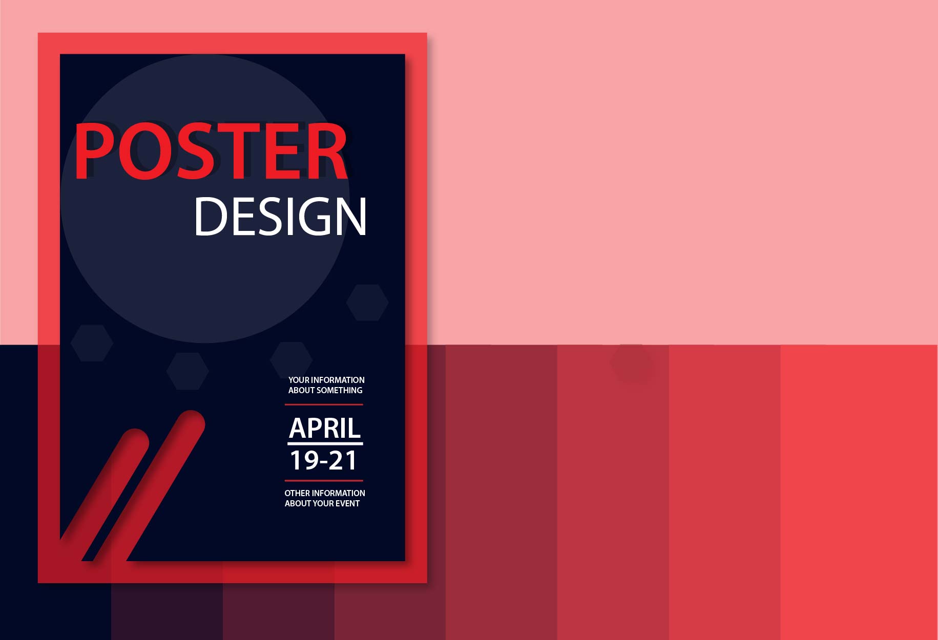 Image credit: DB Design
