Case Study - “Libero”
Brand Identity Design for Skin Care Cream
 Denis Bozhinoski
 July 12, 2021
Graphic Design case studies are a way for designers to demonstrate their problem-solving skills to clients in greater detail. This is achieved by defining the client's problem and the designer's role, along with an overview of the designer's process.
In this case study we invite you to look at the brand Libero, a skin care cream. Libero comes from the Latin word Libero which means freedom. The brand name was chosen in order to give a feeling of freedom from dehydration or dryness after applying the cream on your skin. The name is also short, striking and easy to remember and pronounce.
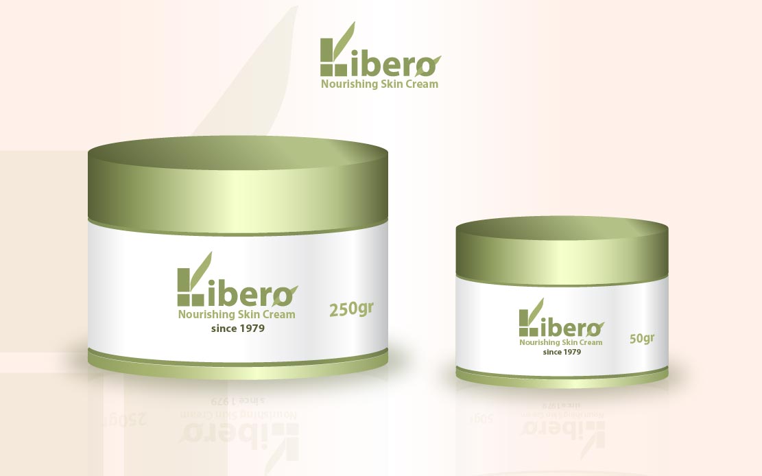
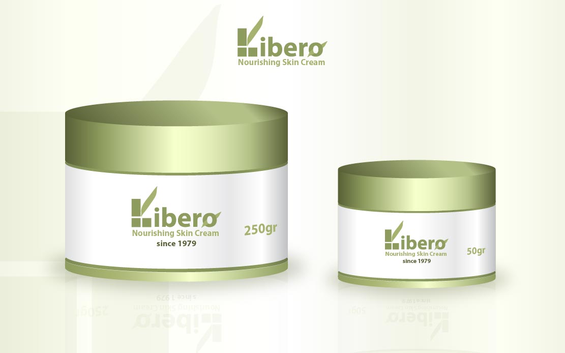
Libero is the Design story where the main role was played by brand identity and visual presentation. The brand identity part includes logo creation, brand color guide and typography. Visual presentation contains an explanation for the visual representation of the product itself and all the graphic elements in the design of the product.
01
About Libero skin care product
Libero is a skin care cream that has a role in nourishing our skin and regenerating protective cells. This brand was created to help people with dry skin.
02
Logo Design Process
The first part of creating a logo involves a discussion with the client about the company's goals and the use of the product.
Once you have created a good project brief with your design team, it is very important that the project brief be approved and verified by your client. This is a very important part because you need to have similar expectations with your client about how the final design will look like.
After researching the target audience and researching the market, the design studio began creating different variations of the logo. Variations such as wordmarks, letterforms or monograms and abstract logo were presented. In the end the client preferred wordmark variation as the best visual presentation of his brand.
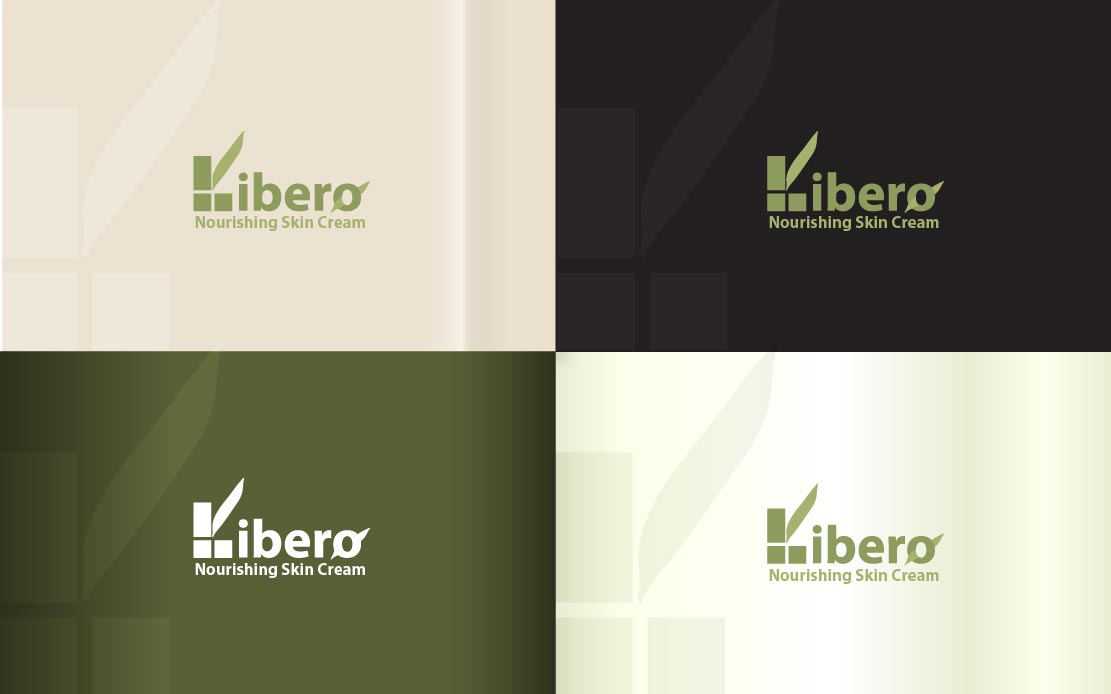
It is also important to mention that at this stage of creation of the logo a color palette was created and chosen for the brand Libero. When choosing colors, you want to choose colors that match with the client’s brand personality and stand out from the competition. Colors are very important part in the competitive world of beauty and cosmetics.
The design studio used different variations of contrasting colors but selected one were olive green light, olive green dark and shades of olive green. The final logo is presented on a light and dark background in order to get bigger impression in web marketing and print campaigns.
03
Visual Presentation
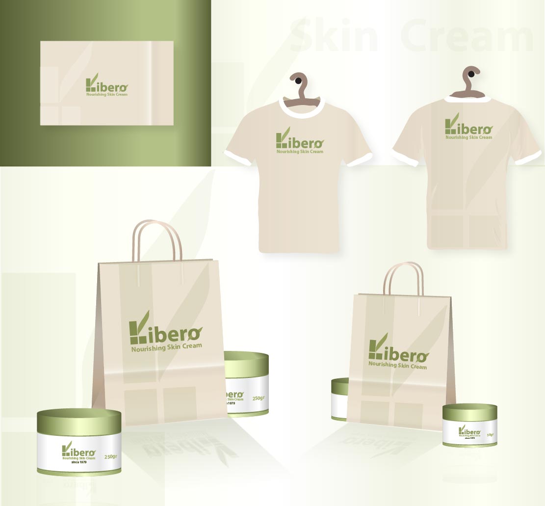
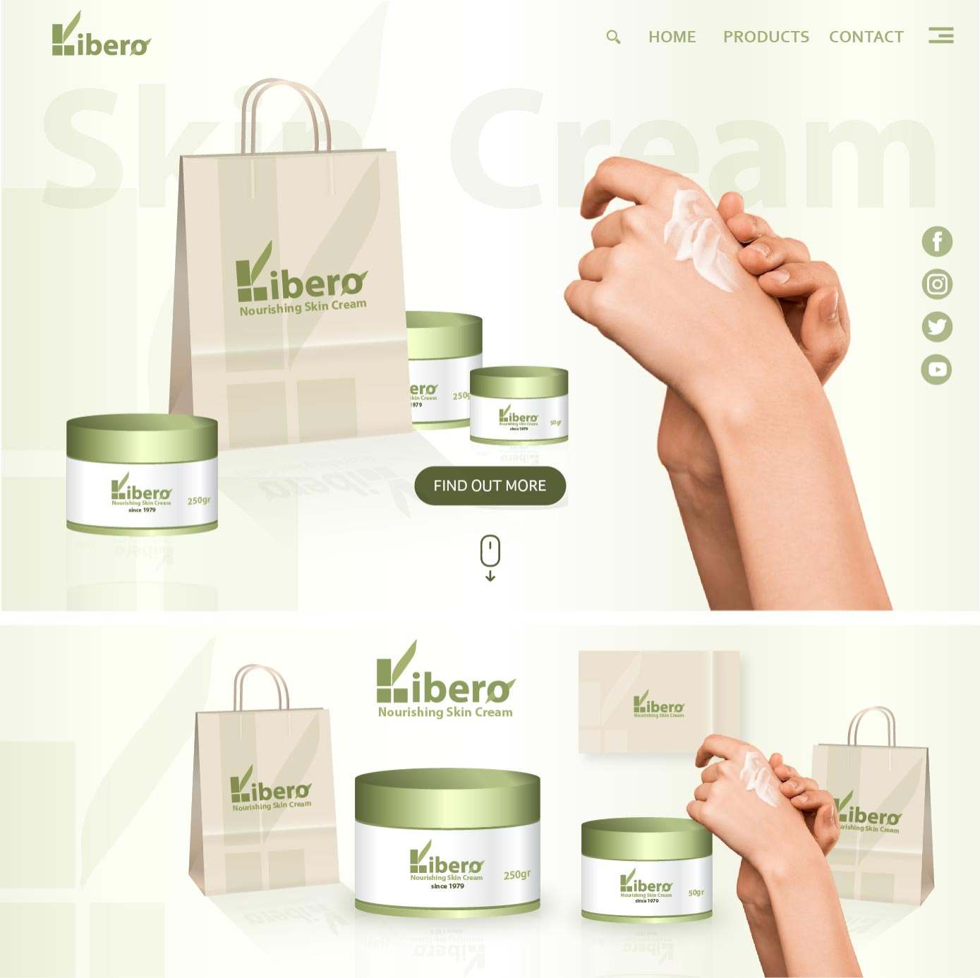
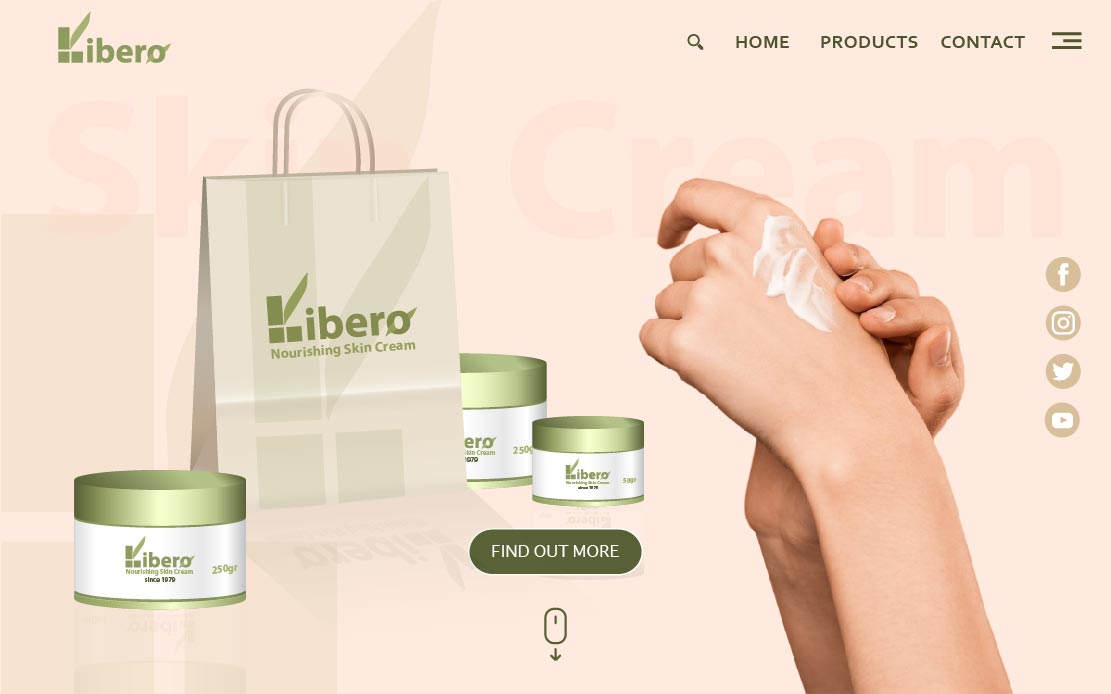
In order to achieve better communication with the user, digital and physical design of the product were created. The visual presentation was achieved with key graphic elements such as logo, colors and typography. For the digital presentation of the product was created small e-commerce website. For the physical presentation of the product were created branded t-shirts, business cards and bags.
04
Branded T-shirts and Bags
Branded T-shirts are a great way to attract and promote as well as to make your brand popular in your area. It attracts interest and builds a customer base. For greater promotion of the product, branded t-shirts and bags were distributed. They were distributed in order to increase the awareness of the user about Libero skin cream product.
The design of the t-shirts and bags was inspired and created through the color of the nature. An application in shade of green was placed over the entire T-shirt and Bag using the first letter of the logo on a light green background.
Green is the color most associated with nature because this color is the most common color in the natural world. Therefore, the same color is also associated with a blissful life, health, freshness and energy that comes from the nature.
05
Website Design
Even just a simple designed website can give you an advantage in your business and if you have products to sell, your site can open up new markets and expand your business economically and easily. Your customers are looking for you online and website makes
your business more professional and gives you more flexibility and options.
For greater sales and web promotion, a website was designed where you can find all the information about the Libero product. We keep the website interface simple and we create consistency using common UI elements. The colors of the website were chosen from the color palette of the brand that was created during the creation of the logo. The colors that predominate on the website match with client's brand personality, soft tones and shades of green olive color.
The type fonts, button styles, heading sizes, image styles, image sizes and backgrounds also were designed to correspond with the clients’ brand personality.
Brand case study helps to ensure that your campaigns are bringing your brand towards the right direction and is generating the positive impact on your brand and product.

