YOU WANT THAT TO STAND OUT AS MUCH AS POSSIBLE WHILE ALSO KEEPING THE LOGOS IN THE RIGHT SPACE.
MCLAREN DESIGNER REVEALS HIS UNLIKELY SECRET WEAPON ON THE RACE TRACK
May 2, 2021
IT’S NO SECRET THAT RACE CARS are as much billboard as they are fast as hell machines. It’s still a business, after all, and McLaren Racing is no exception. Balancing the two worlds comes down to Simon Dibley, and it’s something the McLaren design specialist always keeps in mind. “You have to design for standing still and for going 200 miles per hour,” Dibley tells Inverse.
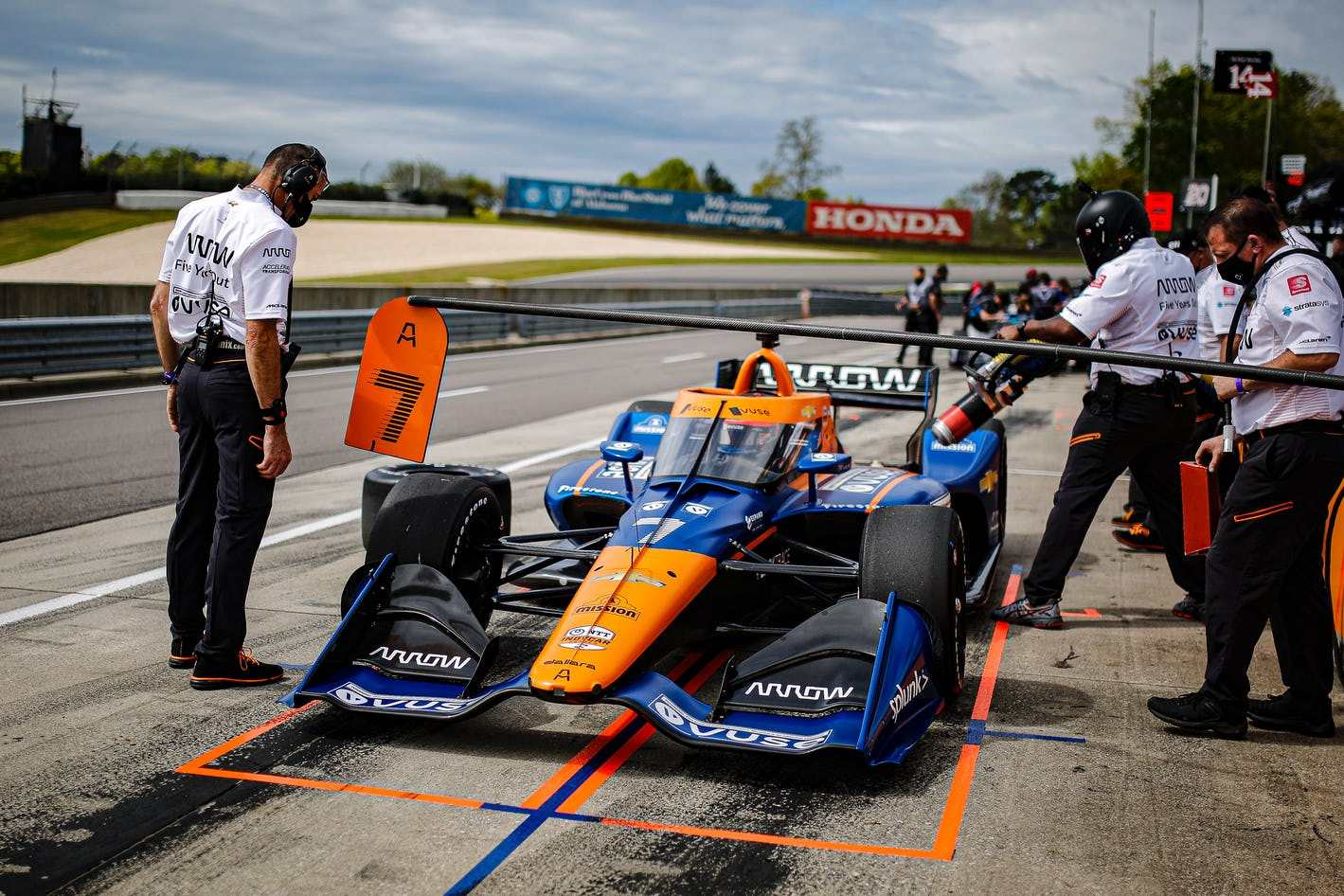
Race cars might get around the track powered by bravery and sweat and engineering prowess, but it’s all fueled by sponsorship cash—and most of that cash comes from slapping corporate logos everywhere. But with dignity. The world of racing is fast-paced, necessitating building speed into the entire design ethos.
MCLAREN PAPAYA ORANGE
Dibley’s job to make sure that everything from McLaren’s business cards to its car liveries — the paint and design scheme, everything from the sponsor logos to the color of the car — are up to snuff.McLaren is lucky in one way, though: it has papaya. That’s the name for the iconic and shockingly bright orange that is the McLaren Racing team color, and it has much historical significance (like so much in racing) for the UK-based outfit.Papaya was first used on McLaren’s factory cars back in 1968, and the team brought it back to Formula One for the color’s 50th anniversary in 2018. When McLaren Racing returned to America for the 2020 IndyCar season after 40 years away, papaya came along too.
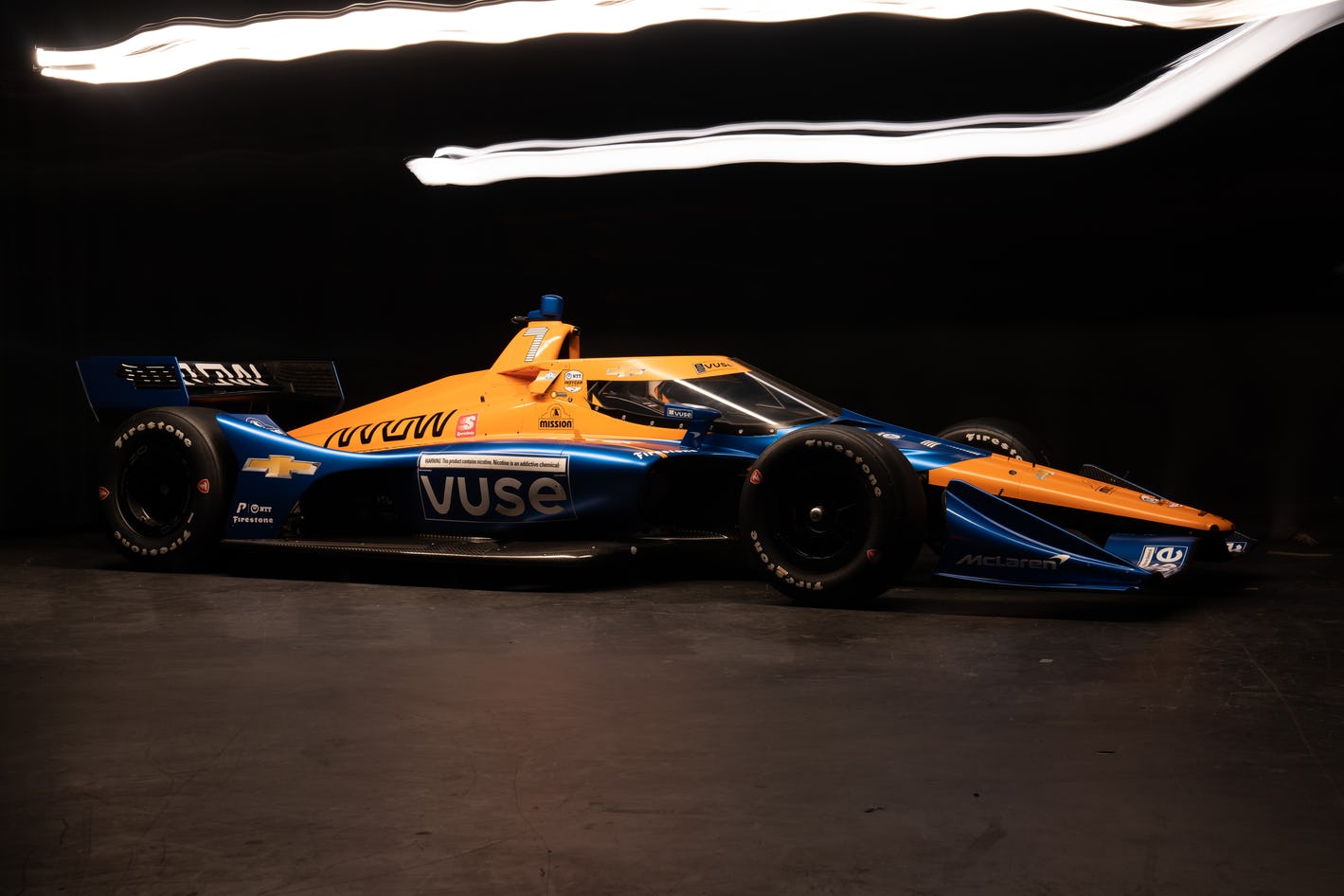
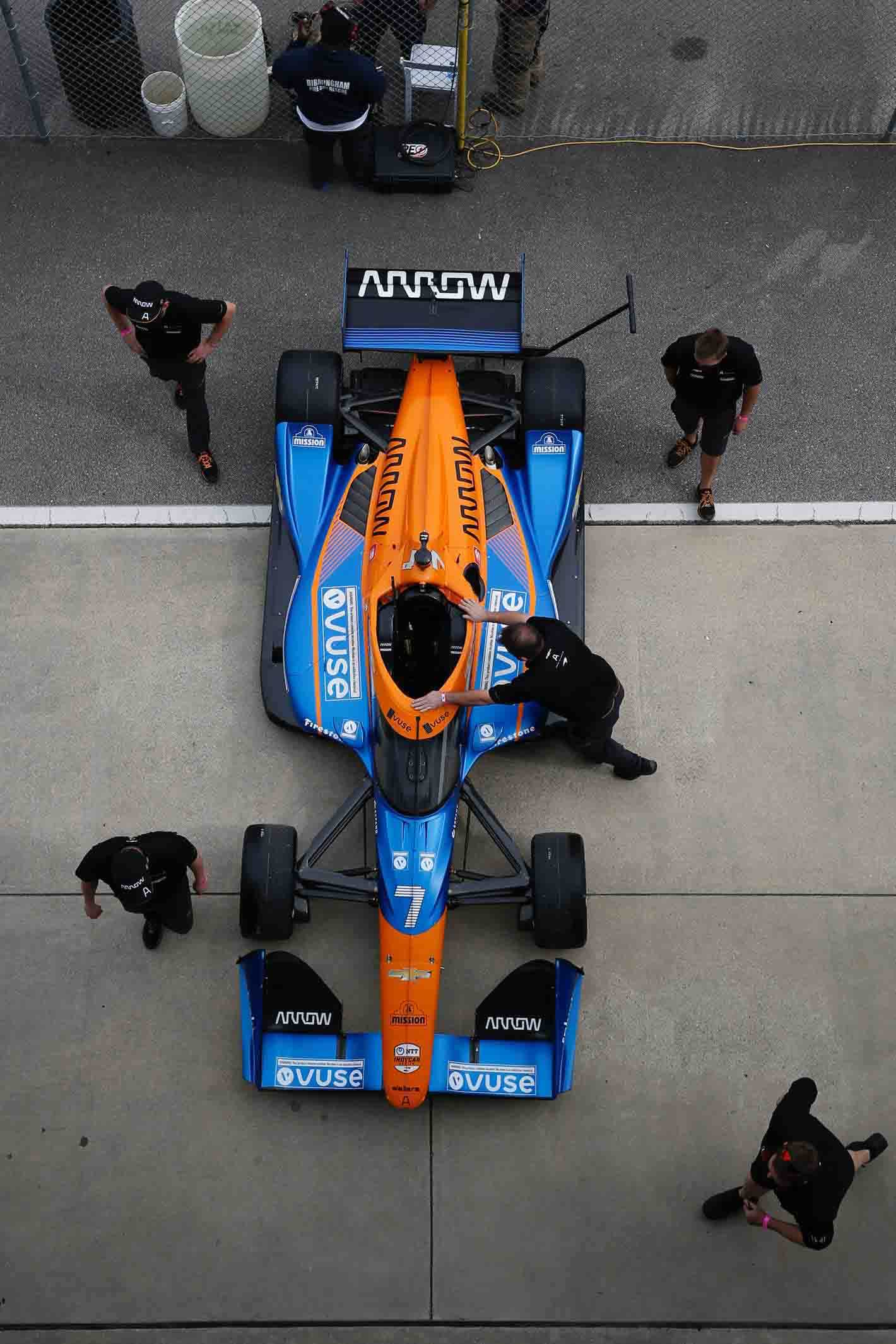
But there’s much more to a racing car livery than a single color. Those sponsorship logos need a place to live, and there is a long list of requirements: they need to be recognizable when the car is standing still, when it’s ripping along at 200 MPH, when it’s turning left, when it’s turning right, when it’s stopped in the pits, and, if all goes well, when it’s sitting in victory lane.
“We're quite lucky with having Papaya,” Dibley explains. “That really stands out on the grid. We’ll use that as a block color, a base for putting the branding on. You want that to stand out as much as possible while also keeping the logos in the right space. We’ll design the livery to have a specific space for branding.”
IN F1, THE CAR CAN CHANGE RACE BY RACE. A DIFFERENT SIDE-POD WILL ALTER THE WAY THAT A BRAND LOGO OR A GRAPHIC IS PUT ON.
DESIGNING A MOVING BILLBOARD
Needing to look good in so many scenarios also means simplification. “We keep most logos mono. Black-on-white,” Dibley says. “Some brands have different contracts, like Chevrolet on the IndyCar side that always has to be in color. But we try to keep to mono most of the time to have an equal standout on the papaya.”
McLaren’s IndyCar liveries are papaya-and-blue for the Vuse-sponsored car and papaya-and-black for the Arrow-sponsored car. Over in Formula One, the rules are different, and the cars have to be identical.

Liveries start life in Cinema 4D, a 3D rendering and design program, with multiple renders featuring different color schemes. Then it’s a jump to Adobe Illustrator because it’s quicker to iterate and rework designs in 2D than it is on a rendered car, but eventually, it heads back to the 3D model.
“You can rotate it and see how it would look at different angles. If you have bold enough colors, then it will likely look good at 200 MPH going around a track,” Dibley says. Designing for television is of primary concern, especially these days with severely diminished fan attendance thanks to COVID.
“A lot of the cameras pan when the car is going around the corner, so you get them slowing down a little bit,” he says. “It's more about the base colors. The design at the back does the heavy lifting of standing out on track. With our blue and papaya, the cars are going to stand out no matter what.”
As with any sport, fan sentiment plays a big role too. “When we flipped back to papaya, you could see quite a positive change come through our fans,” Dibley says. With McLaren racing in both IndyCar and Formula One, having papaya as a unifying color across all the company’s racing efforts is essential for brand identity.
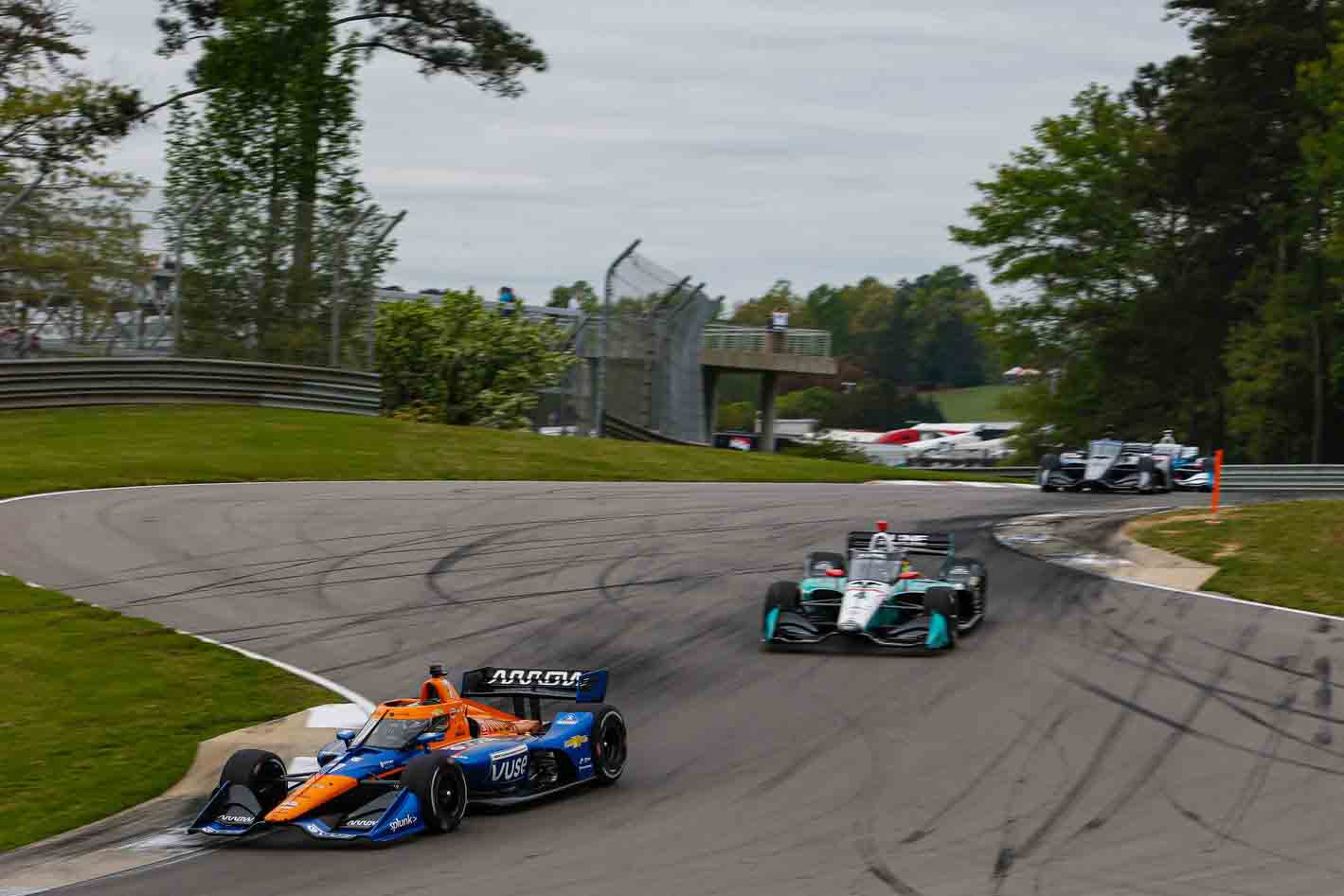
Racing concerns crop up too. Different parts of the car are aerodynamically important, and it’s not always possible to put vinyl decals everywhere the designers might want to. But it gets even trickier when parts of the car change, like the air-intake side-pods in Formula One.
“In F1, the car can change race by race. A different side-pod will alter the way that a brand logo or a graphic is put on,” Dibley says. If it changes shape, either by changing in size or in curvature, “they no longer can go as large as they were before, so we always have to account for those things.”
The design team works closely with the race engineering side to ensure everything looks good and that the aerodynamics of the car aren’t compromised — or given away. When the design team builds digital renders to share with sponsors and the press at the beginning of the season, sensitive aerodynamic bits on the front and rear wings — a huge competitive secret in racing — are obscured or blanked out entirely.
HOW LIVERIES CAN MAKE THE CAR
Everyone has an opinion on a livery. Perhaps nothing, aside from the drivers themselves, is more important to a racing team. The colors adorn the clothing, the garage, and the fans.
Even countries have their own racing colors. British Racing Green is iconic. The Germans have silver and the current Mercedes-Benz F1 team still sports the Silver Arrows nickname, while the Italians (or Ferrari, more accurately) have rosso corsa. Japan uses white. Ultimately while the car might be wrapped in a corporate veneer, the emotion and the art behind the branding are genuine.
But advertising is the name of the game. That’s why Vuse, a vaping brand, is the primary sponsor for one of McLaren’s IndyCars. It’s rather amusing to see all the “this product contains nicotine” warnings on the car, and it's a long way from the unashamedly-pro-tobacco red-and-white Marlboro branding that used to adorn McLaren’s F1 cars in the 1980s.
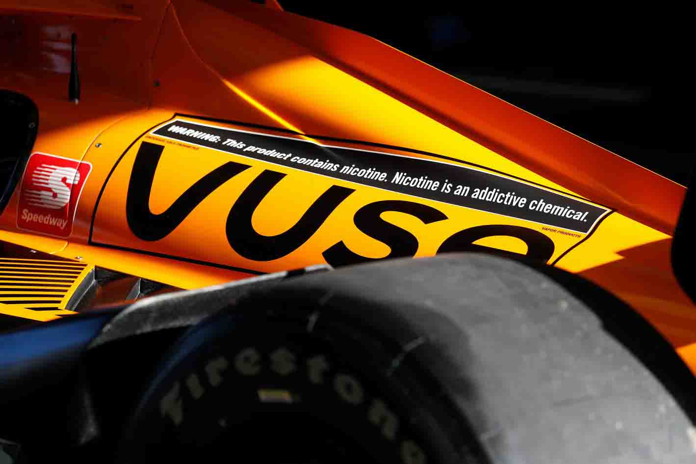
But no sponsorship deal would be complete without a marketing stunt. However, this one is pretty neat: Vuse and McLaren are running a design contest that will see a fan-submitted livery adorn the #7 car for the August 8, 2021, IndyCar race in Nashville, Tennessee. Dibley is one of the judges.
“I think it'll be very interesting to see where they get their inspiration from,” he says. “Whether they go down a passion route or a classic livery, it'll be a great opportunity for someone to see their work on the track. It'll be very cool.” Submissions close on May 31, 2021.
Source: Inverse


