Burger King serves up retro-inspired identity in first brand refresh after 2 decades
Jan 12, 2021
Burger King has fired up a brand refresh as it kicks off the new year, marking the first complete rebrand in more than 20 years. According to the company, the new visual design will “more authentically represent Burger King values” and signals a commitment to a digital-first expression and recent improvements to taste and food quality, as well as its pledge to environmental sustainability.
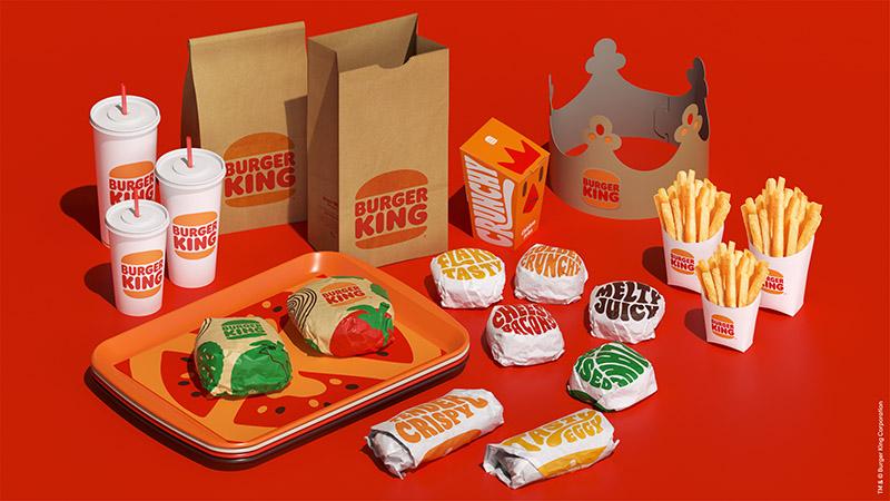
The new minimalist logo pays homage to the brand heritage with a refined design that’s confident, simple and fun, and seeks to meet the brand evolution of the times. Gone is the blue curve that has been used since 1999. The logo resembles the retro one which was used from 1969 to 1999. The selected colours are also rich and bold, inspired by the iconic Burger King flame grilling process and fresh ingredients. The new photography is also hyper textured and plays up the sensorial aspect of the food.
Burger King
Burger King also introduced a new brand font named “Flame”, inspired by the shapes of its food – rounded, bold, yummy, and its irreverent personality. At the same time, its new packaging will proudly showcase the logo, as well as bold colours and playful illustrations of ingredients.
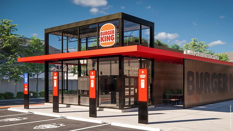
The brand will be rolling out a new brand logo, packaging, restaurant merchandise, menu boards, crew uniforms, restaurant signage and décor, social media and digital and marketing assets.
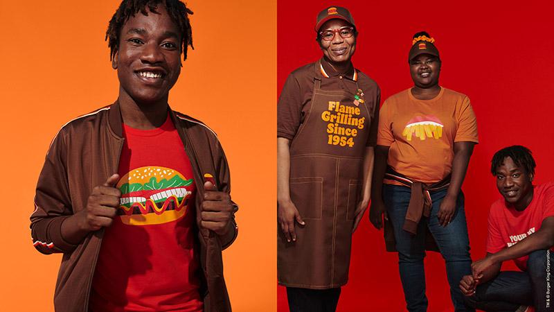
The new crew uniforms reflect flame grill masters, mixing contemporary and comfortable style with distinctive colours and graphs. According to the company, real crew members are also featured in its advertising. MARKETING-INTERACTIVE has reached out to Burger King for additional information on the refresh and its marketing plans moving forward.
In a LinkedIn post, global CMO of Restaurant Brands International, Fernando Machado, shared a text by JKR New York’s creative director Julie Rutigliano, who cheekily said that the brand had no idea what it was thinking in 1999, when it decided to refresh the retro logo in celebration of the upcoming millennium. This was done with a blue swish and making it flashier, brighter with the type soaring on an angle.
“And just like that, one of the world’s most iconic, groovy, needs two hands to hold its awesomeness of a logo died a quick, uncelebrated death. Sometimes in life, you just have to give yourself a real honest look, and say it’s time for us to re-write, or in this case, re-design an old wrong. And what happened to the Burger King logo in 1999, was, well, wrong,” Rutigliano said.
So, the team figured it was a good idea to “go back to when [Burger King] looked [its] best and start from there. “Let’s forget about trying too hard. And when people take to Twitter asking ‘Doesn’t this kinda look like your old logo?’. Let’s be proud when we answer them, hell yeah,” she said.
Meanwhile, Raphael Abreu, Restaurant Brands International head of design, explained that design is one of the most essential tools the brand has for communicating who it is and what it values, and it plays a vital role in creating desire for its food and maximising guests’ experience.
Source: Api News
Design StageDesign Services